FOUNDRY WORKS Campaign 04 · One send, every inbox
One send every inbox
Foundry Works is a fictional maker campus in a former iron foundry, invented for this piece. Below is one of its marketing emails, built as a real responsive HTML file, then followed around: how it renders in light and dark, and what each major mail client actually receives. Open the file and read the source.
01
The brief
02
The system
open for fall
03
The send
The four hall slabs are the merchandising: each one is a full-bleed color block carrying the hall's name, its numbered dot, one line of availability, and a link. Under 480 pixels the display type drops from 76 to 44 pixels and the gutters tighten; the slabs already span the full width, so they simply keep doing it.
04
Dark mode
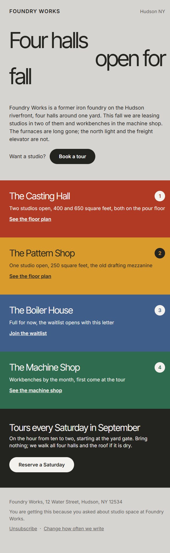
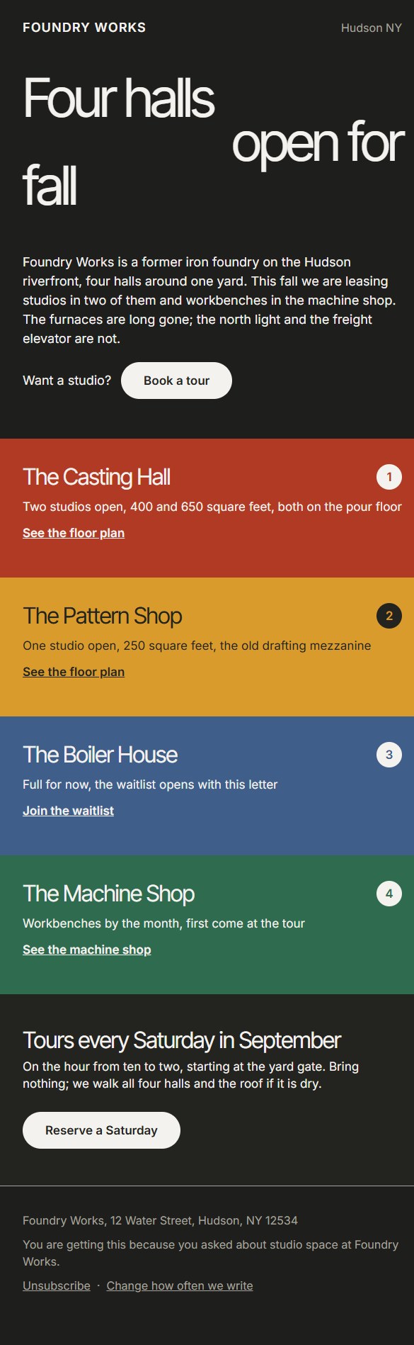
Both columns are the same file, rendered in a browser with the color scheme flipped. The canvas and the text swap; the four hall slabs do not move, because each one was chosen to clear WCAG AA against its own text color rather than against either canvas.
The file carries dark mode three ways. Clients that honor the standard get a prefers-color-scheme media query. Outlook.com and the Outlook apps rewrite colors themselves, so the same second palette is repeated under their data-ogsc and data-ogsb hooks, with the slabs, badges, and plate text pinned to the values they already pass. Classic Outlook for Windows reads neither; its Word engine runs an inversion no sender can target, so the light design is written as the source that inversion starts from.
05
The client plan
Apple Mail and iOS
- Loads the self-hosted Inter Tight and Inter over the fallback stacks
- Honors the prefers-color-scheme query, so it gets both palettes
- Runs the 480 pixel query: full-size display type on the desktop app, 44 pixel display on a phone
Gmail
- Reads the embedded style block and the 480 pixel query, so the responsive layout survives
- Never loads webfonts: the full Helvetica and Arial stacks are inline on every declaration
- Ignores prefers-color-scheme and recolors on its own, so every color also sits inline, giving its rewrite known values to start from
- The whole send is one file with no images, far under the size at which Gmail clips a message
Classic Outlook for Windows
- Renders in the Word engine: it gets a fixed 600 pixel table held by a conditional wrapper, and a Word-only style block relaxes the crushed display leading so nothing clips
- Every pill is drawn twice: a VML roundrect for Word, the real anchor for everyone else
- Skips the media queries and webfonts by design; the light palette in Arial is the source its own untargetable dark-mode inversion starts from
Outlook.com and the apps
- Rewrites colors in dark mode instead of reading the media query
- The data-ogsc and data-ogsb attribute hooks hand its rewriter the same second palette the query declares, and pin the slabs, badges, and plate text
- Everything else follows the Gmail path: embedded styles, inline colors, fallback fonts
- The new WebView2 Outlook for Windows follows this path too, not the Word engine
06
The engineering
- LayoutNested tables with role="presentation" throughout, a hybrid 600 pixel container with an mso conditional wrapper, no flexbox or grid in the structure.
- Dark modeOne palette swap, declared twice: a prefers-color-scheme media query for standards clients and data-ogsc plus data-ogsb rules for the Outlook rewriter, both flipping the same classes. Classic Outlook inverts on its own and cannot be addressed.
- StructureOne level-1 heading and five level-2s carried on role attributes, so the send keeps an outline for a screen reader while every layout table stays presentational.
- ContrastEvery text pair clears WCAG AA in both palettes by the WCAG 2.1 relative luminance formula. The tightest pair on a slab is paper on furnace red at 5.40:1; secondary text sits at 4.66:1 on the light canvas and 6.63:1 on the dark one.
- No imagesThe send contains no image at all. The slabs, dots, and pills are colored table cells, so blocking remote content changes nothing and there is nothing to alt-text away.
- Type floorNothing below 16 pixels anywhere, including the footer and the unsubscribe line. Body runs 17 to 18, display runs 76 on desktop and 44 under 480 pixels.
- Preview textA hidden preheader div sets the inbox preview line and pads it so the first body string does not leak in after it.
- TouchBoth calls to action pad past a 44 pixel target, and each hall link carries 12 pixels of padding above and below to clear one too.
- FontsSelf-hosted Inter Tight and Inter behind an mso guard with the full fallback stacks inline on every declaration, so Word never touches a webfont.
Spec work by Ryan Allen | all demo concepts
Part of the fullbuild.ai gallery.